Landing pages (also known as opt-in pages or squeeze pages) are pieces of content specifically designed to get visitors to submit their contact information.
Unlike web pages, which can have many different goals, landing pages are designed with a single focus in mind.
Marketers often use them to capture leads for paid marketing campaigns, social media promotions, webinar registrations, free trial sign-ups, etc. They are specifically designed to get users to enter their contact information in exchange for something.
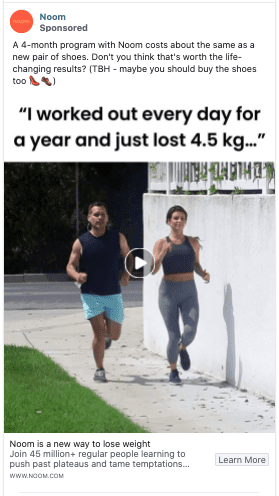
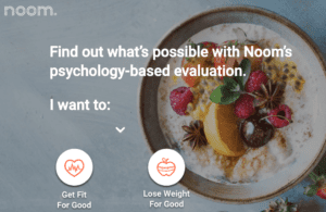
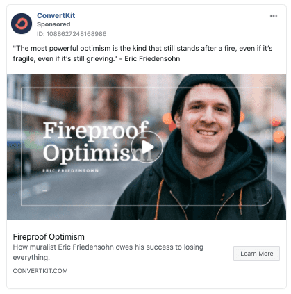
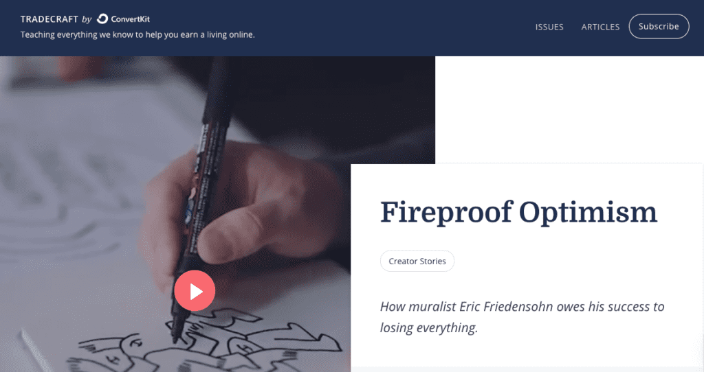
You’ll often see landing pages when you click on ads shown on different social media platforms. These campaigns frequently push users to landing pages with a contact form that asks for their contact information.
In simple terms, the landing page is where your users take the desired action (sign up, download, enroll, etc) for your middle-funnel campaigns.
Today, I want to go over some of the best practices, examples, and ways to create different types of landing pages that will convert your visitors into leads and customers.
We’ll go over examples of beautiful landing page content and tactics that work great for each stage of your sales funnel. Plus, we included a landing page template for you to download so you can step-by-step create a landing page from scratch.
Ready? Let’s go!
Best Practices To Create High-Converting Landing Pages
Design & Content should solve customers’ problems, answer their questions, and/or teach them how to use your product.
There are best practices to create high-converting landing pages. Let’s go through some of these elements now:
1) Keep consistency in the messaging and visuals
Keeping consistency between the landing page and the content that links to it (i.e. same message, same offer, same language). If there is a disconnect there, it is a really bad user experience. If the ad is saying one thing and the landing page with the offer says another, you’re going to see a massive increase in bounce rate, people not converting and people filling support tickets. You want to create consistent messaging from wherever the users first see it (maybe the ad) and to the landing page.
2) Avoid having too many CTAs on your landing page design
The CTA is how you get your users/subscribers to take action on your blog post, landing page, ad, social post, or email.
You always want to stick to a single CTA per page. There are very few situations where you will have more than one. You want the users to see what the offer is – it should be very clear, and simple and there should be a single thing that you’re trying users to do.
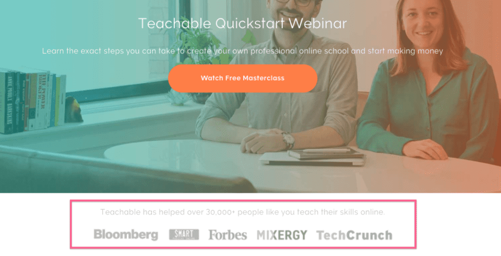
3) Improve trust by including social proof
You can improve trust by adding logos, testimonials, or any kind of other people’s stories that make users do the same.
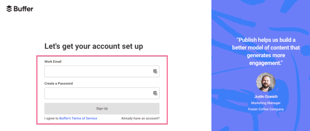
4) Reduce friction to complete the action
Reducing friction is about reducing the number of steps your users need to take to complete the desired action. This translates to shorter instructions, fewer clicks, less scrolling, and fewer form fields.
You want to ask the absolute bare minimum from the users. If you don’t want their full name, zip code, interests, etc, you should remove those fields. Any element of friction is generally going to drop your conversion rates.
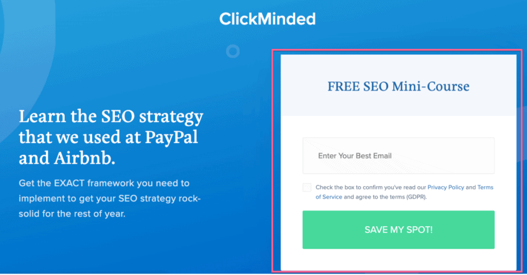
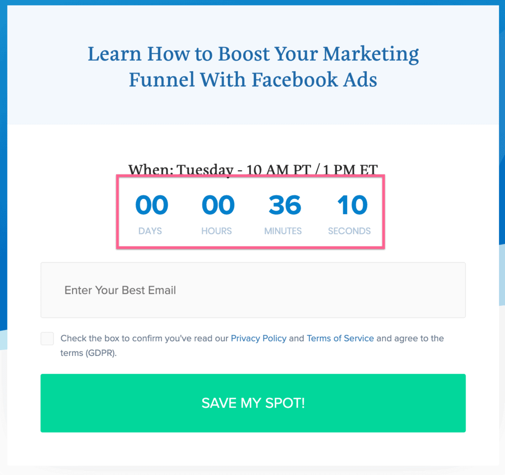
5) Add urgency with countdowns or deadlines
This is a fantastic practice to have on your landing page if you can do it in an authentic, true, and meaningful way. Using deadlines and FOMO is a way to short-circuit this behavior—it gives people the motivation to take action. Adding any type of urgency with countdowns or deadlines usually increase conversions.
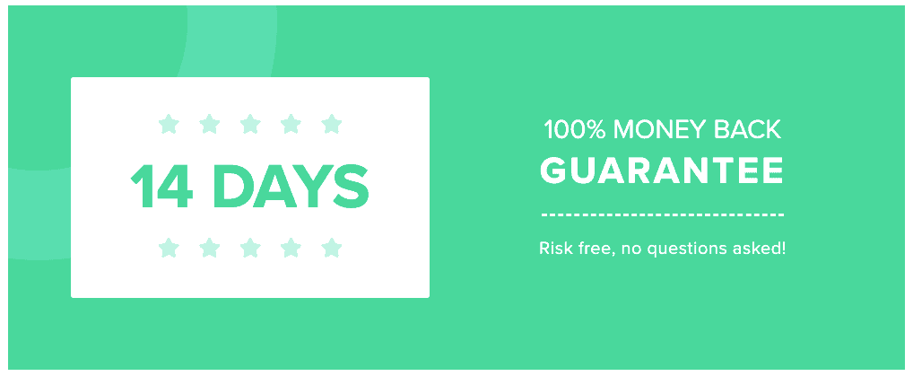
6) Overcome possible objections with trust signals or guarantees
Any trust signals, guarantees, or money-back guarantees can help when users have buyer objections at the last minute. If you know what your buyer’s objections are and you can overcome them, this is a fantastic way to do that on your landing page.
Long Vs Short Landing Pages
Every business should have one—regardless of whether they sell products online or not. We’ll discuss that in a little bit more in detail in a minute. But here’s how you can write a great sales page from scratch. There are 2 types of landing pages: short-form and long-form. We aren’t talking about the checkout page – we are talking about the page that essentially has the pitch and the offer.
There’s a massive debate about which one is better—we believe the answer is “it depends”.
Short-form sales pages are great for businesses that sell relatively simple and inexpensive products.
For example e-commerce startups, consumer SaaS, and brick-and-mortar businesses.
Long-form sales pages usually work well for businesses with more expensive or complex products.
For example agencies, high-end info products, enterprise SaaS
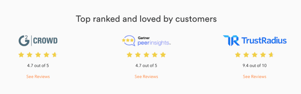
(This isn’t a hard rule—see what’s working for other people in your industry or test different types of sales pages yourself!). They use 3 types of social proof:
1) Online reviews
Here are the people who gave us a rating and here’s what they are saying.
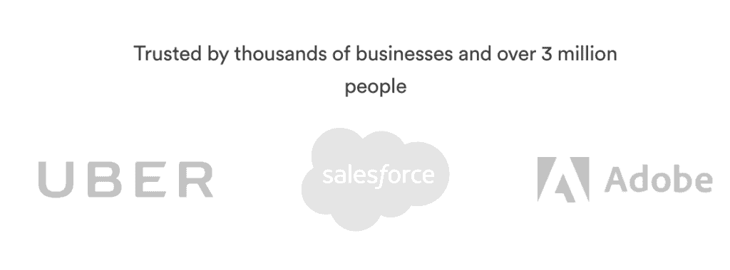
2) Logos of large corporate users
These are the big companies that might be customers of yours that you can add to your WordPress homepage.
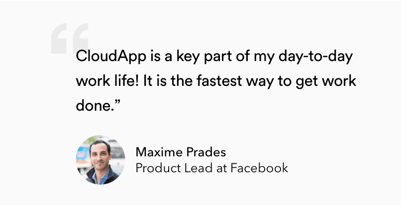
3) Testimonials
The third one is testimonials. They are actual people with actual faces and what they have to say about your company or the product.
For people who want more details, they include a demo video which you can incorporate as well. This is for people who want to dig into the details. You shouldn’t be expecting every user to be watching the demo video.
Finally, they repeat the CTA they used above the fold right at the bottom so users know what they are getting.
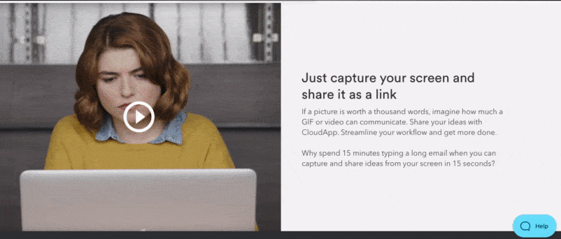
With a short sales page, CloudApp accomplishes a lot:
- Explains what the product does
- Highlights benefits for each target persona
- Builds trust
- Goes over the main features of the tool
Pro Tip: To create landing pages, you can use landing page builders like LeadPages, Instapage, Unbounce, or Welcome.ly
Ready to Use Our Landing Page Template?
The first thing most people will do before any of that is to look you up online.
That’s where your landing pages come in.
We’re going to help you create your landing page from an incredibly human perspective.
Turns out that when you treat humans like humans, and not like numbers on a CPM dashboard, they appreciate it!
In our landing page template, we’ll provide you with tactical ideas and walkthroughs that will help you fill in the blanks for your business.
Take our free landing page template to create the right landing page for your needs and launch your campaign today.